
Ocean Park – The Tjaps
Hey There!
Miss me? I know I have been absent from here for awhile, but I am back, and I have lots to share, cause I have been a busy little beaver!
I have been soooo wanting to share the ‘names’ and my thoughts behind the individual tjaps from Ocean Park with you. Have you been impatient? Do you remember what ‘tjaps’ are? They paint the stage for my little village of Ocean Park, and I hope you can see how these relate to the overall story.
There is the one thing about my batik lines that you may notice are different than print lines. You don’t always get the same designs in different colors, sometimes the colors I thought would work in a design just don’t go with anything else. Maybe that’s because I love so many colors and therefore some great ideas, just don’t “sell” as well with the rest.
Dune Pools is an example of that. Only one coloring of this design. I love this one so much. Mostly because that line through the middle of the circles was a complete mistake. When I saw it, I thought “Hey, I LIKE that….let’s do some more….” and there you have it. One version of Dune Pools.
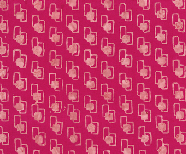
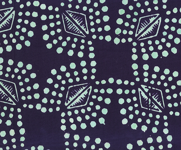
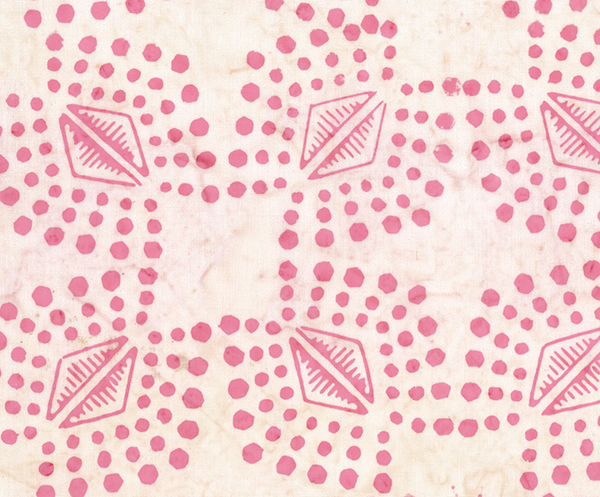
Next up is Pearl Street. Not sure why I called it that. I guess it is kinda of easy enough to see why. It really didn’t pop though until I add the reverse images in the large “pearls”. That was just the thing to make it work better for me! I can totally see Natalie from Mermaid Avenue wearing a pearl necklace, can’t you?
And then Pearl Street with metallic bits…..Kinda fun addition I thought.
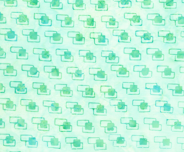
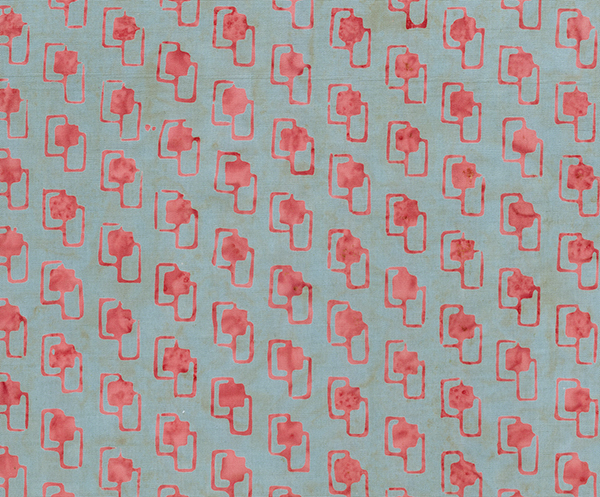
I REALLY wanted a nice small basic in this line. I felt I was missing that in Tie One On. This next one filled that need. Pavers, for what I imagine are paving stones spread throughout our little town of Ocean Park in many of their gardens. I am working on a summer Camp Shirt out of the light green and white Pavers tjap.
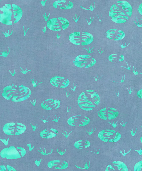
Next up >> Sand Change…. In my head, I was thinking….”Not Sand Dollars….but Sand Change” I know, totally goofball right? Do you see the one element I pulled in here from Tie One On? My plan is to have that little “Easter egg” in every line I produce. At least for now.

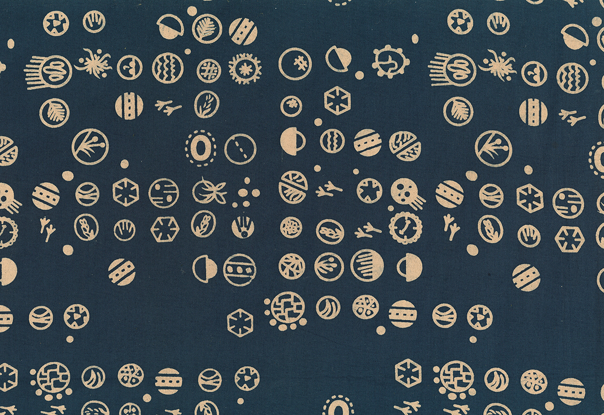

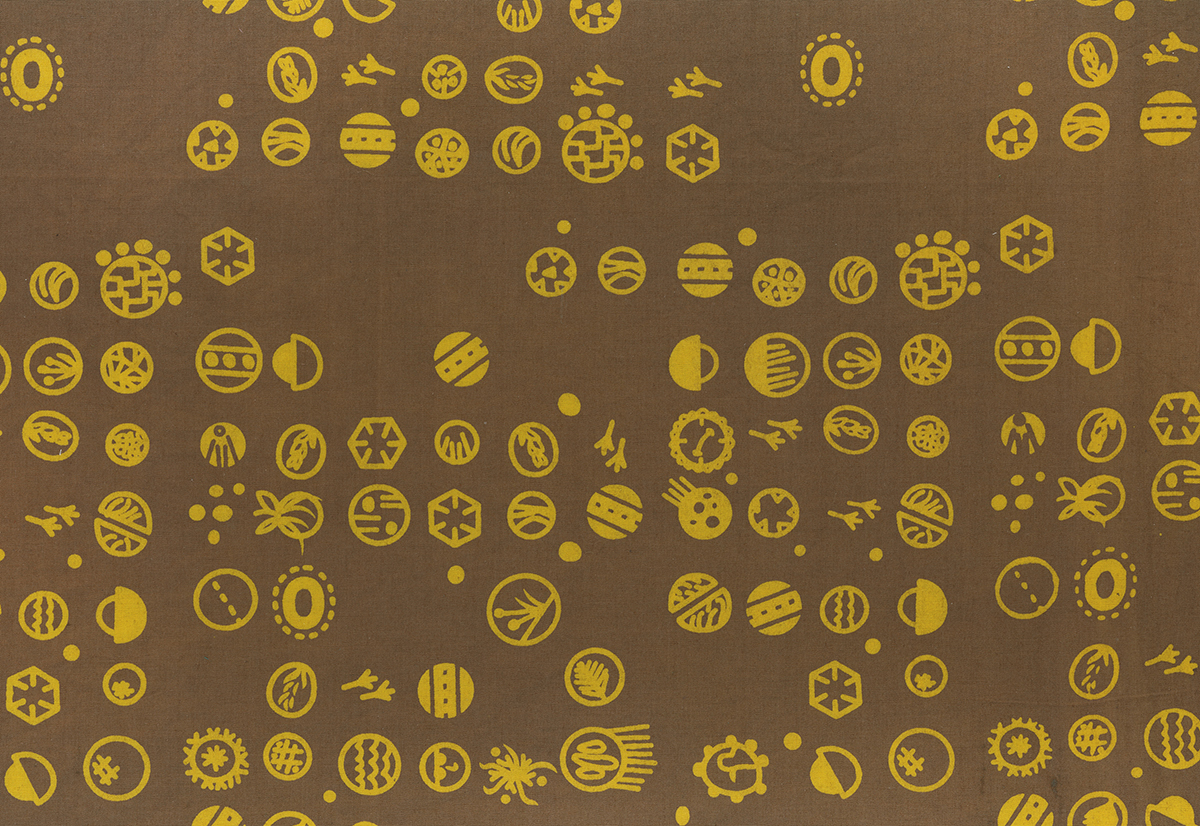
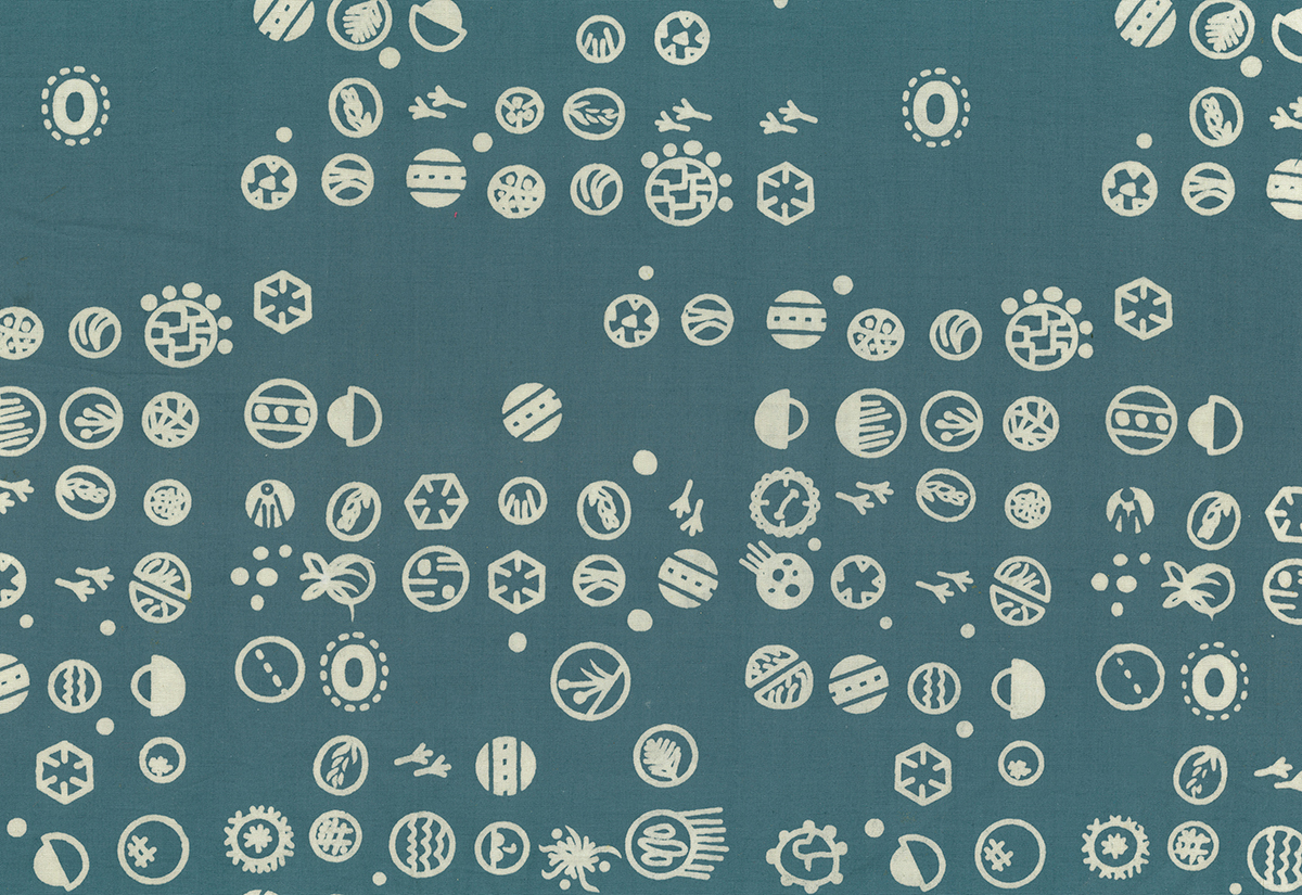
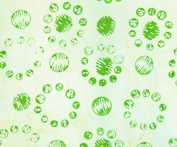
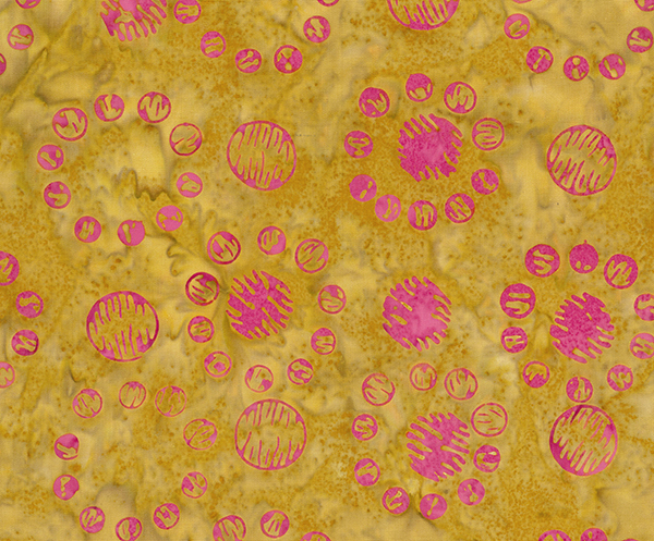
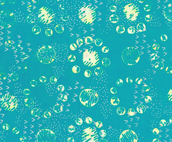
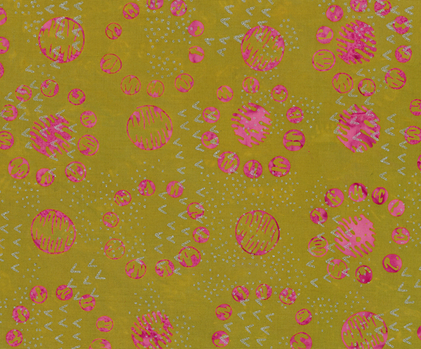
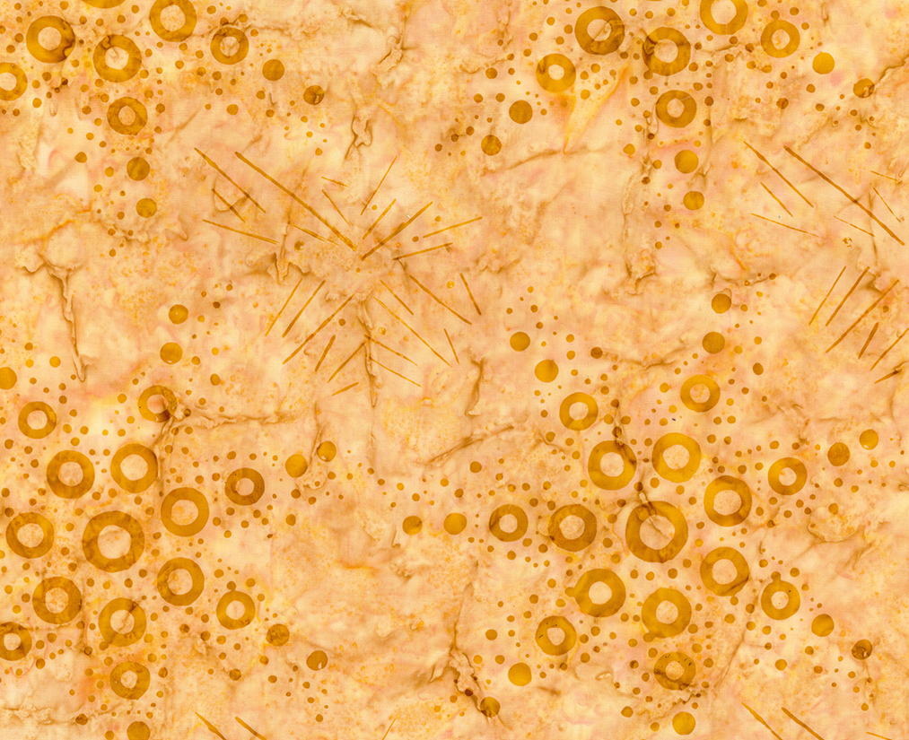
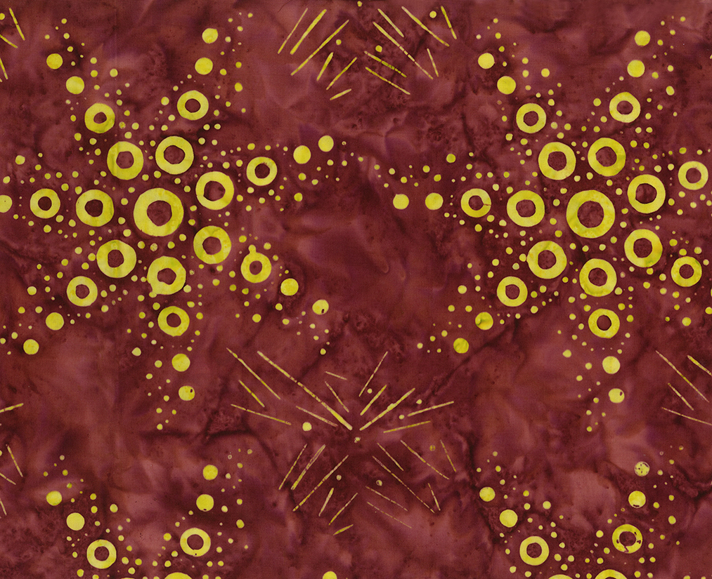
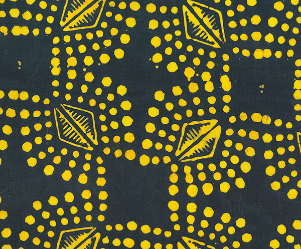
Next is Sea Star…. in hindsight, I didn’t really realize how many circular images I was using. But I did…A LOT of them! Linda, my wife, LOVES the two darker versions of this design!


And if I were going to pick One Favorite, which frankly I don’t think I can — This group, Royal Sands, might be it. I am LOVING how the Purple and White came together, and this is from someone whose least favorite color is Purple! This design started out as the ripples left in the sand as the tide is going out. Then in another variation they looked like Neptune’s crown. Finally they became this. And I think they are looking pretty good!

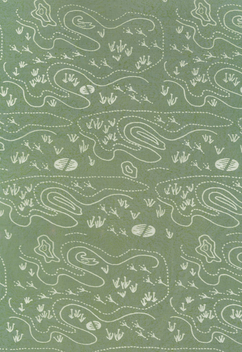
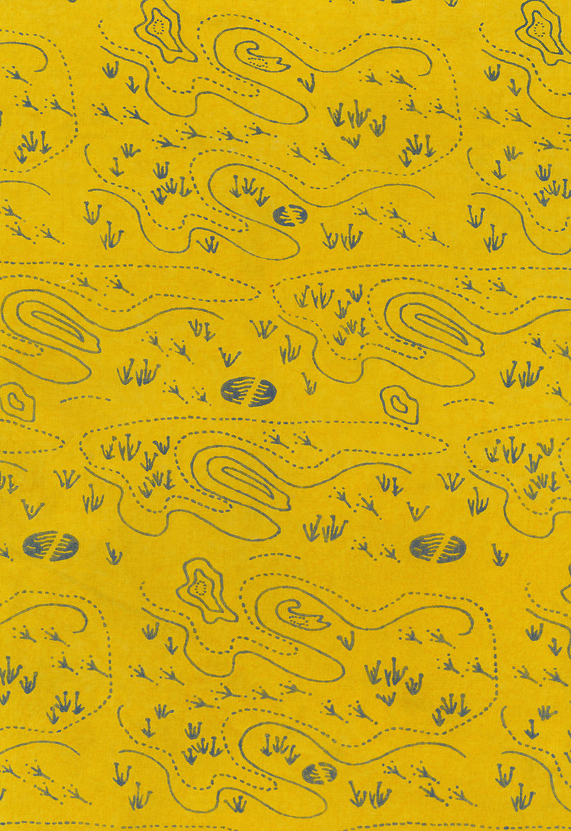
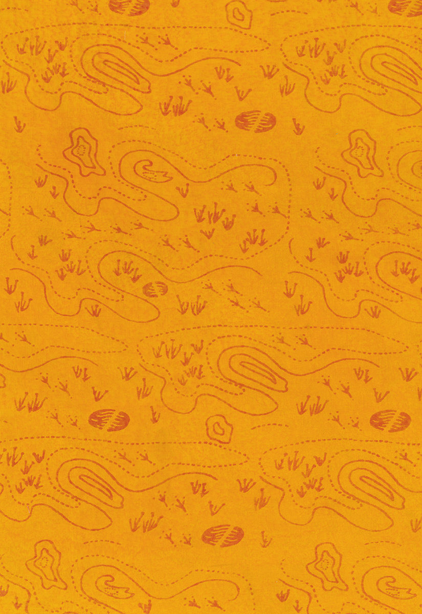
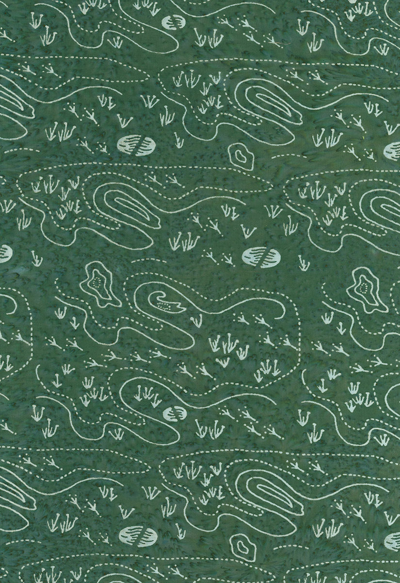
And Lastly Topography, wherein I pulled some Dune Pools into. Good thing I did since we only have one overall Dune Pools now, huh?
So there are some of my thoughts on the Ocean Park tjaps….One of the big goals I had in this line was to get a better mix of Lights, Mediums, and Darks. I think I did this fairly well.
Do you have favorites in this collection? Please leave a note in the comments to share with us all. I am really looking forward to seeing what you do with Ocean Park!
Keep Sewing, Keep Happy,
Scott
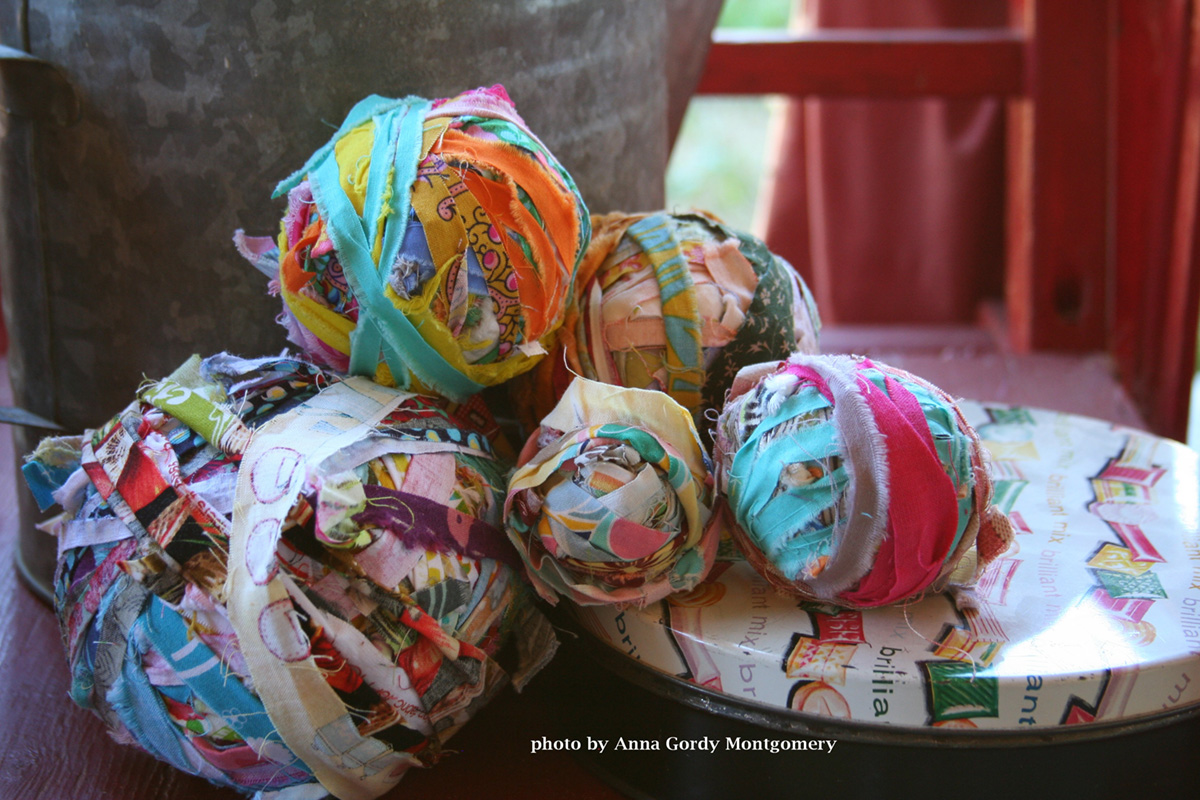
PS Quilt featured in the Lead Photo is a digitized Ocean Park version of my New Glory Pattern found here.
Ginger
Looking good Scott. I agree with Linda on the two darker ones. I also love all the ones with that awesome yellow mustard color, especially the one with pink pearls.