298: Winners again…and more Quilt Market Presents….
Let’s cut quick to the chase shall we??
we have winners from the last post….and another prize follows….
Rosanne Derrett
who wrote:
I have to admit to many, many cheapskate failures. I’ve used cheap thread and cheap fabric with some fairly horrendous consequences.
The best of these has to be the poly cotton quilt top backed with a poly cotton sheet but with 4oz wadding. None of the pieces are correctly sized, so they don’t fit together, everything stretched and buckled. Even my trusty machine went on strike with this horror. The end to this project was when my delinquent Bengal decided to empty his bladder on it. I have not touched it since.
There was the cheap petrol incident, and the one where I tried to get home on the fumes in the tank and ran out half way home on the motorway, in the rain and with no breakdown service. Then there is going shopping online and finding the local shop has the same thing a lot cheaper and with no postage. My list is endless.
Rosanne was: So Roseanne you win Bari J‘s signed book just like you were there in Salt Lake City and everything…. you just need to send me your snail mail address via email at bluenickel5 (at) earthlink (dot) net…..
and our second prize winner is…..
who wrote:
Oh man! I can so relate to you with this post!! I have done a lot of these money saving projects that ended up costing more than the original idea. I don’t know why I never learn – although the last “project” I made myself instead of buying I showed my husband and told him the next time I say “Oh – I can make that” – he must immediately hit me in the head and say just buy it!! Anyway – I heard a funny story yesterday from my sister in law. Her Mom – my mother in law used to make her first four daughters all their special outfits so they would all match (it was a ‘50’s thing!!) My mother in law decided when the girls were going to take swimming lessons, she wanted to save money and make their bathing suits. She chose a waterproof material that happened to be just like the material you use for outdoor upholstery. The problem was when the girls jumped in the water, the swim suits became waterproof but weighed about 10 lbs! My sister in law said they were exhausted after each lesson because the bathing suits weighed so much when they got wet!! But they matched!! And they were cheaper than the real thing!! Yikes! Thanks for sharing your story – makes me glad I’m not alone in this crazy world!! Have a great weekend!!
Laurie please send me an email with your snail mail address as well….and I will send out the Lizzy House journal and the Zipper patterns to you!
Thanks everyone for coming along for all these great prizes….I really enjoyed hearing your stories about how “cheaping” out actually became much more expensive….hopefully we all have learned our lessons now!! :p
Here is the next prize up!!
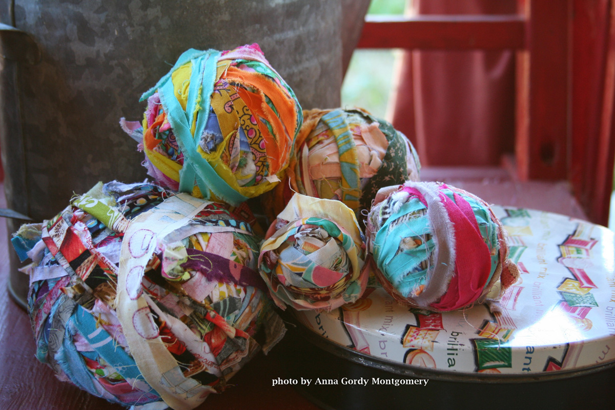
From Robert Kaufman….two great charm packs (Pick a Bunch and Veranda), two Dr. Seuss pens, and a HIGHLY sought after Kona Solids Color Card…these are hard to come by, so you seriously can thank Allie at Kaufman for this little bundle of goodness!!
So to win this one, leave a note telling me what solid color you would use for the background in a quilt if you were going to use a solid…and give it a “creative” name….not just tan or white or grey… “winter sky” or “fire engine” or “banana” or something like that okay?? and for a second chance either ReTweet this drawing on Twitter, or put it on Facebook, or put in your blog and come back and tell me you did at least one of those for a second chance to win!!
And just so you know I am actually getting something accomplished here…..
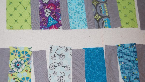
here is something I am working on for an upcoming magazine quilt….
and here is something that my friend Carla Crim came up with that you absolutely must go download right now!!
That’s it for today’s post….so let me know what solid you would most like use for a background in your next quilt with a solid background….and remember even Racy Red can be a “neutral”…..at least according to Freddy Moran! (and me!!)
Ooopps!! I forgot to give this giveaway a deadline…let’s say you have until Thursday the 9th evening-ish Pacific Standard time….



DianeY
Well, I think I’d use persnickety pink, because I’m in a persnickety mood! Hmmm-maybe Moody Blue for the back!
Kathy Howard
I would use cool shady green (green-blue) in a light value.
Jeanette
after today it would be Moody Blue ;o)
robin
I’d use Moonscape. 🙂
robin
Tweeted! http://twitter.com/#!/birdie00000/status/77579807835160576
Thanks for the chance! 🙂
Mary on Lake Pulaski
The background for my quilt is going to be grosbeak rose!
Jacqueline
huuummmm…… Id say a grey lavender color… ya know, that misty purpley color that just invokes magic…. <3
Cory
I want to use Chocolate Cake for my next background color. Take care and God bless, Cory
Patty
I would certainly use a gray called Seattle Sky. Great idea!
Lisa
I’d use Strawberry and Vanilla Icecream (very pale warm pink!). Actually, I think I’ll go check the freezer now!
Kim
A quilt I’m refurbishing is going to have a solid as it’s backing because it will truly work much better than anything else. And after much stewing and thinking and all that, I’ve decided that Sandy Beaches is the winner. Or in plain speak, light tan.
Alexis
I always tend towards “My Favorite Lipstick” (red)!
Jen
How fun! I would love to see Red Dirt in my next quilt! What a great giveaway!
Pat V.
Hmm, I love fall colors, so I’d make something with a reddish-orange background called “Autumn Sunset.”
Tabatha
My brain is running on empty. Turquoise. Aqua. What other descriptives are there?
Azure is too blue.
On Wiki, Turquoise, is Turquoise.
Some designers call turquoise “aqua” but not much more.
In the end, it’s Hydrated Copper Aluminum Phosphate, it’s turquoise, spectacular and especially with orange!
Patty
My background would be Oklahoma Clay, a shade between red and orange.
Karen
I would use stormy sky, which is a strange orange color I saw in the sky before the worst rain storm Yuma, AZ has ever seen.
Karen
I tweeted the giveaway- @savinggrc
Lynn D in NC
I would use a pale aquamarine color like you see in the clearest and most beautiful sea waters and call it “Nourish my soul”.
Jewel
Hydrated Copper Aluminum Phosphate… no just kidding… how about Prasiolite?… a stone that is in my anniversary ring this year… a very Pale Green Amythyst.
Sandy A in St. Louis
Wow, good question! I am wanting to make a quilt for my nephew and he is an avid outdoors man. I think I would use buckskin or walnut bark as backgrounds, or maybe even fig tree green.
Syd
I would use a yellow, maybe Passionate Popcorn!
Chelley Black
I would use smoky teal. Thanks for the giveaway!
Chelley Black
Tweeted by @aggiebabe1
katieQ
I would love to use a Cherry Tart Red. When you mix cherries with other ingredients they have a slight sheen. That’s what I want for my next quilt.
Shelley C
Hubby just bought me a plaid couch. fore the den…I wanted black leather…hmmmph. But the price was too good to pass up and I think I can work with it…I want to paint the walls a primitive yellow gold and if I had to rename the paint I think I’d call it Minneapolis Moline….that’s something hubby can relate to…:)
Barb in MI
How about Meringue – hmmmm, sounds delish as food or fabric! Thanks for the giveaway!
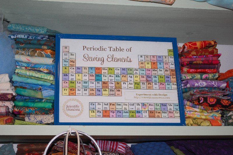
I absolutely love the periodic table of sewing elements – thanks for sharing!
MaryBeth
Since the Kentucky Derby wasn’t too terribly long ago, how about Julep (as in mint julep) Green? My bedroom is green and I’ve been meaning to make a quilt for my bed. Juleps sound good on a hot day!
Evelene Sterling
I would use Bahama Mama Blue in my quilt background.
Love that periodic table so inventive. Thanks for a chance to win.
Heather
Electric sea. This would be a very vivid turquiose colour. I don’t do bland in any way and the more it wakes up the eye of the viewer , the better.
Kelly Rachel
Oh those poor kids in the bathing suits! :S
What a great great giveaway! My colour would be … Twitchy Bunny Nose Pink! Just for the cute. 🙂
oh, now that IS cute….good name Kelly!
Cathy
I would use “Stormy Ocean” because the bright warm colors I would also use could hold their own against it and really pop!
Nancy Sue
I think I’d use Sidewalk Gumwad Gray with Pencil Eraser Pink for the binding 🙂
Jacqueline
I tweeted! =) @jmmaxman (yes, I tweeted bout the giveaway…)
Tania
Scrap the first comment Scott, I shouldn’t do this while being hurried. (first comment obediently scrapped) My stash of brights would look great against that ‘Chilled out Coal’, but I have a collection of blues too which I think would sit nicely on a ‘Rambling Rose’ background. Their ‘Cheeky Chartreuse’ and the ‘Coal’ would make a stunning wholecloth style too! See, I told you, there’s too many to choose from!! ;-}