Ghost by Nel Whatmore
Today’s post is all about a new line from Nel Whatmore for Free Spirit called Ghost.
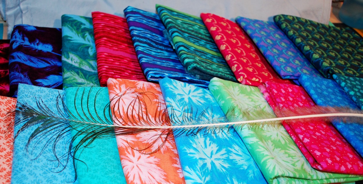
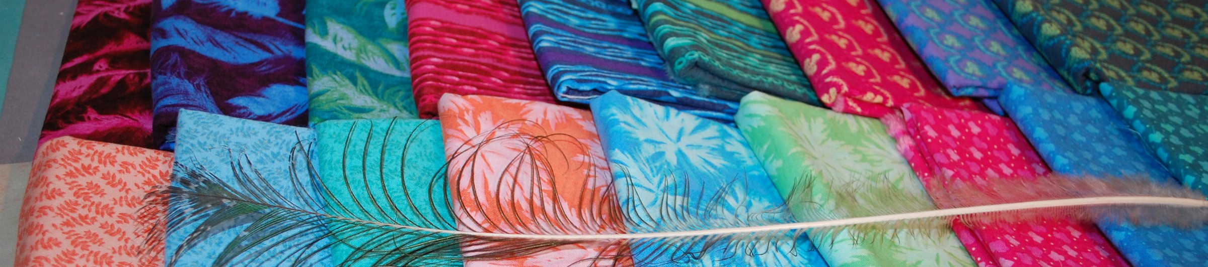
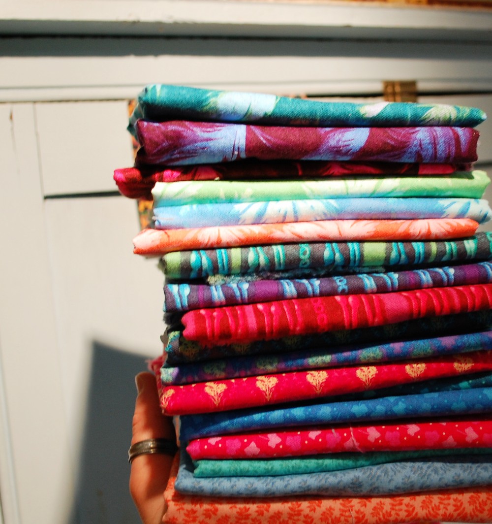
The palette is made up mostly of Jewel Tones and with some lighter Pastel-like Jewel Tones that serve as value contrast. All of these prints are nice quiet tonals because each print reads as a single color overall. My kind of “solids”! You can read Nel’s thoughts on her design process for the line here.
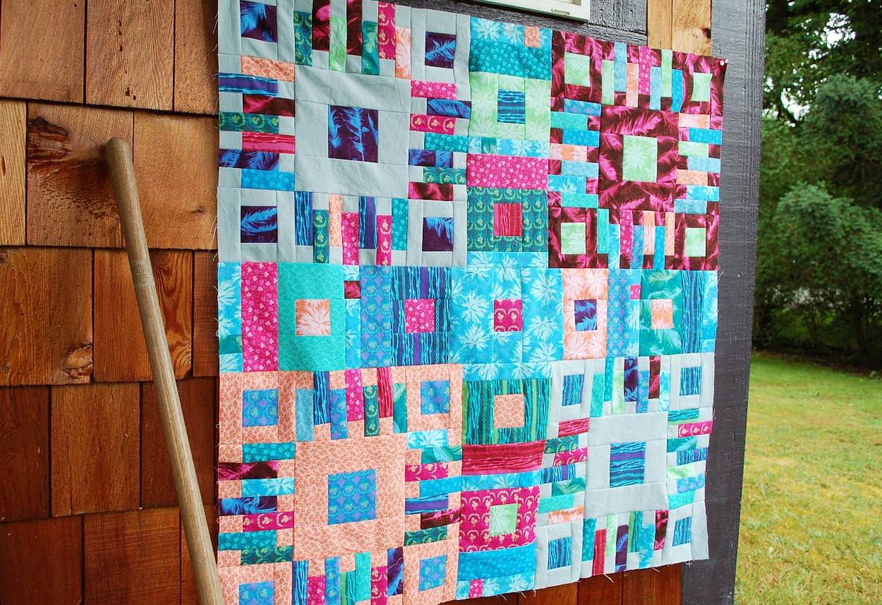
Free Spirit sent me this beautiful line and I thought my Fireside Chat pattern would look good in this line with a solid Grey from Free Spirit’s Designer Essential Solids. Here is an early process photo. I do like the Grey still for its negative space, but in hindsight, I am wondering if a crisp white or a much paler grey would have been better. Still can’t really decide.
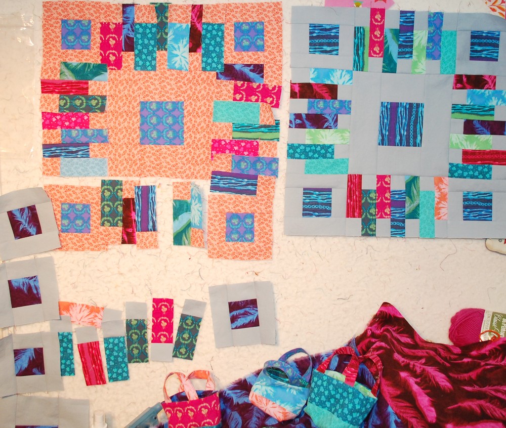
I had fun creating four Blocks from Fireside Chat and then combining them into a wall hanging with a funky sashing using eight of my Modern Little House blocks.
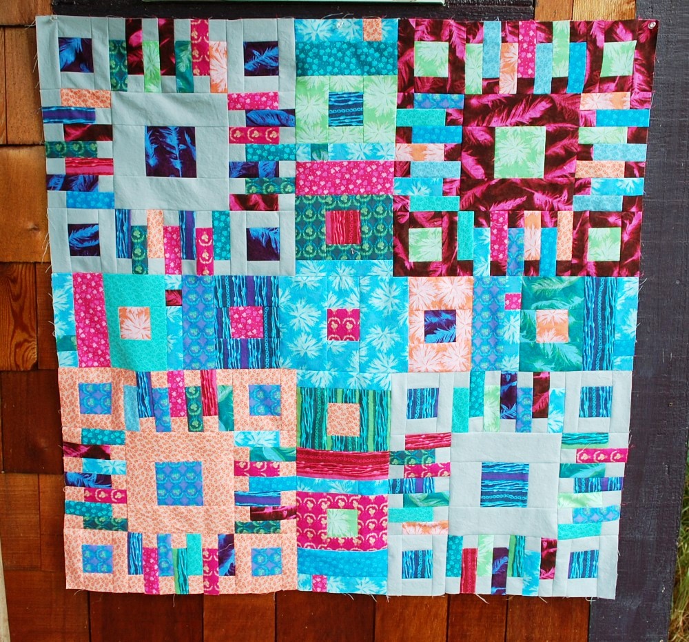
My favorite block is this one with with Feathers in the Dark Hot Pink.

So busy right now though, I will have to put off quilting this until winter probably. This would be a good piece to practice free motion quilting on I think.
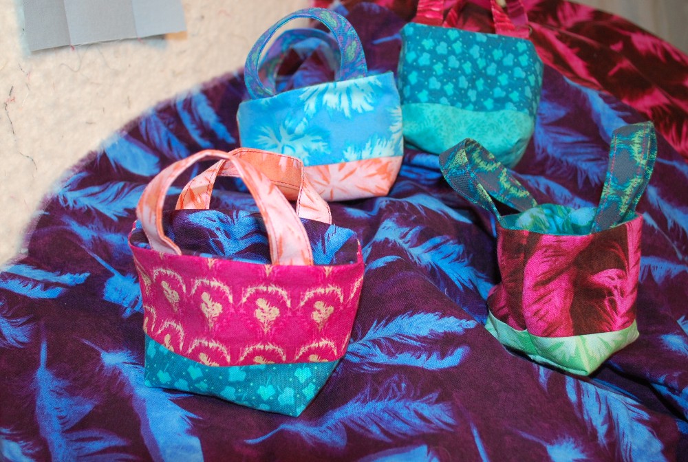
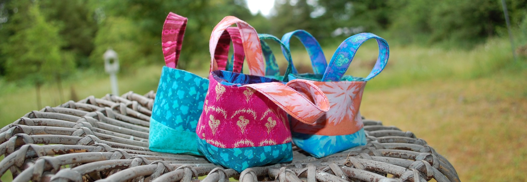
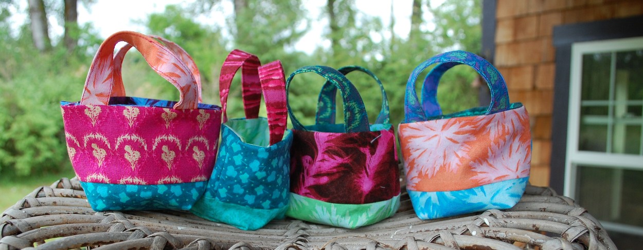
And of course I made some of my favorite bags to make for students – I have Quilters Affair coming up with a lot of students to treat! That Dark Blue Feather print is my absolute favorite of the line!
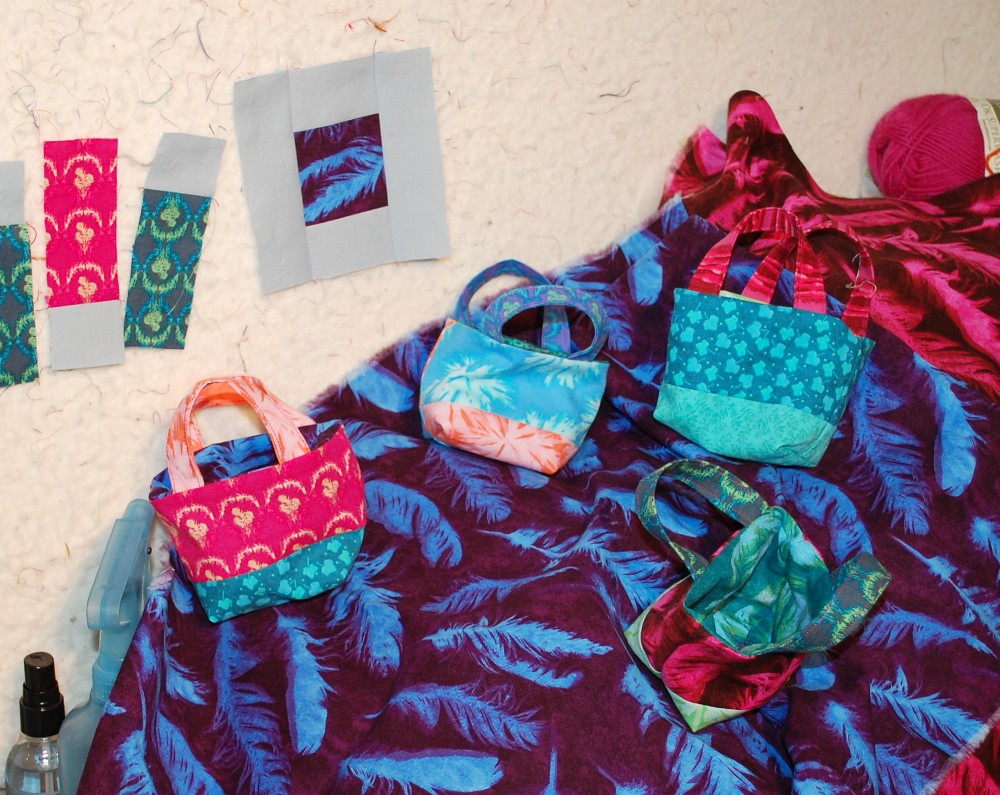
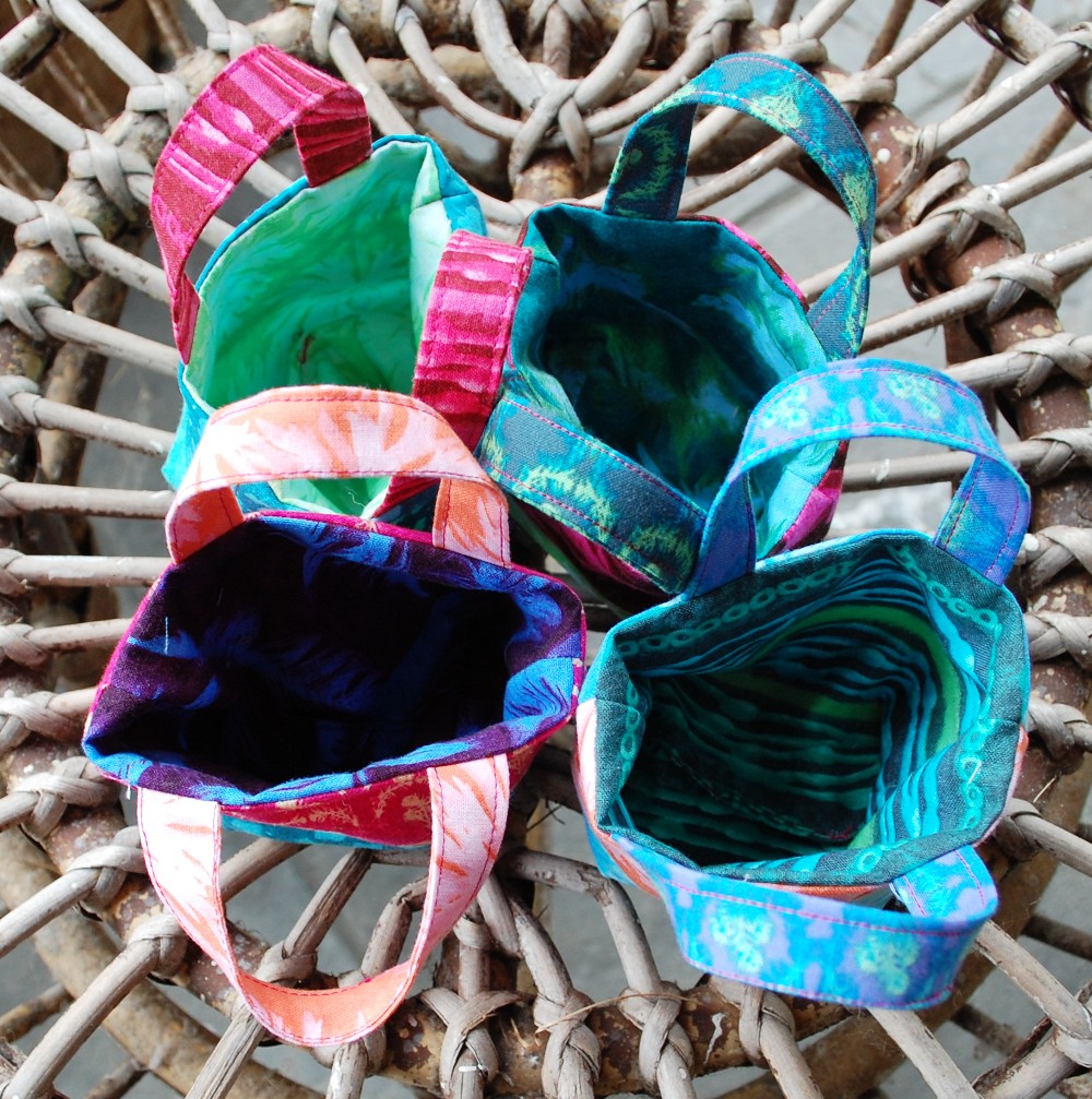
Kind of went overboard on the little tote bag photos, huh?
And then I had some scraps that I had a good time with just laying out and abstracting with! Always fun to do!

How would you like to win a big pile of scraps from this project?
Go ahead and comment here on the blog – let me know which print is your favorite. I will try to make sure that you get a large bit of that in your winnings!
That’s it for today. I will draw a name sometime next week.
Keep Sewing, Keep Happy,
Scott
Giveaway is now Closed – Our lucky winner was Joyce who wrote — “So beautiful! I love the light green with the feathers. Thank you for the giveaway.”
Thank you to all who stopped by the Blue Nickel for the giveaway, Be sure to follow my Instagram feed too because sometimes there are exclusive giveaways there as well.
Tina L.
It is a toss-up between the feathers in dark blue or hot pink. Both have a lovely intensity of colour that will lend itself to some interesting blocks.
Quilting Tangent
The bead print is my favorite.
Sue Pittman
That fabric in the center of the bottom square!
Sandy A in St. Louis
Love the blue feathers! They are gorgeous!
Dianne
The hot pink and deep blue are my favorites
Laura McDonald
I like the dark blue with feathers, and I think the medium gray was a good choice.
sgrancio
I love the ghost-flowers in the lighter values and the beads in the darks!
Janna
I love the blues in this line, great work!
Diane
Another fine post from you…lovely
Joyce Carter
So beautiful! I love the light green with the feathers. Thank you for the giveaway.
Judy
Beautiful line of fabrics. My favorite is the dark blue with feathers.
Becky Gray
I like both of the dark feathers, but probably the pink is my favorite. Like seeing the fabrics I. Fireside chat, which gives me inspiration to try and finish mine.
Kathy E
Such a gorgeous collection of fabrics and using them in your quilt pattern was a perfect choice! Mt favorite fabric is the pink leaf dot, but they’re all knockouts!
Ron Stefanak
Not sure of a favorite as I would use several on a pattern I have yet to make. I do like the beads though.
Rich Denny
Love the blue linear print… I could make up all sorts of crazy with us line.
Jean
I don’t want to leave 2 comments, but I’m not sure my original comment worked. Delete if appropriate.
Michael John
the feather pattern in my favorite and I really like all three color ways but the blue is the best.
David Wind
Would love to work with this line! The feathers and the the ghost splats would be my favorites.
Chris Dineen
The dark blue background with bright blue feathers is stunning!
Jeremy
Love the colors!
JEREMY SHOOP
My favorites are the ones in the bottom row of the first picture showing each
paulburega
Blue feather is my favorite.
Karen
The purple green print….all are splendid
Dan Desjardin
Hard to decide! They are all beautiful prints!
They would definitely say a statement in what ever they will be used for, I think s men’s line of shirts would knock it out of the park! For the guys in the warmer states down south or on the west coast!
Gloria Cotten
I love jewel tones! The bead prints are my favorites but, honestly, I love them all! Thamks for the giveaway!